I redesigned the cover of Nothing Really Bad Will Happen—and yes, I did it for the most modern, unromantic reason possible:
I want people to actually notice the book on Amazon.
Not because the story needed a makeover. The story is the story. It’s lived in my family for generations, in silences and fragments and “we don’t talk about that” pauses. But the packaging? The packaging needed to do what a cover must do out in the world:
- Be readable at thumbnail size
- Make a stranger stop scrolling
- Signal what kind of book this is—instantly
And my original cover… didn’t quite do that.
The Honest Problem: The Old Cover Was Too “Collage-y”
When I first created the original, I did what any author with a deep emotional connection and access to too many meaningful images will do: I tried to include everything.
It was a collage in the truest sense—memory layered on memory. Thoughtful, personal, and very me.
But on Amazon, where your cover often shows up the size of a postage stamp, “thoughtful collage” can quickly become “busy rectangle with words I can’t read.” And nothing kills interest faster than a cover that makes the reader squint and sigh.
So I had to face the annoying truth: the old cover didn’t pull the eye. It didn’t offer a single, clear invitation. It asked the reader to work too hard before they’d even clicked.
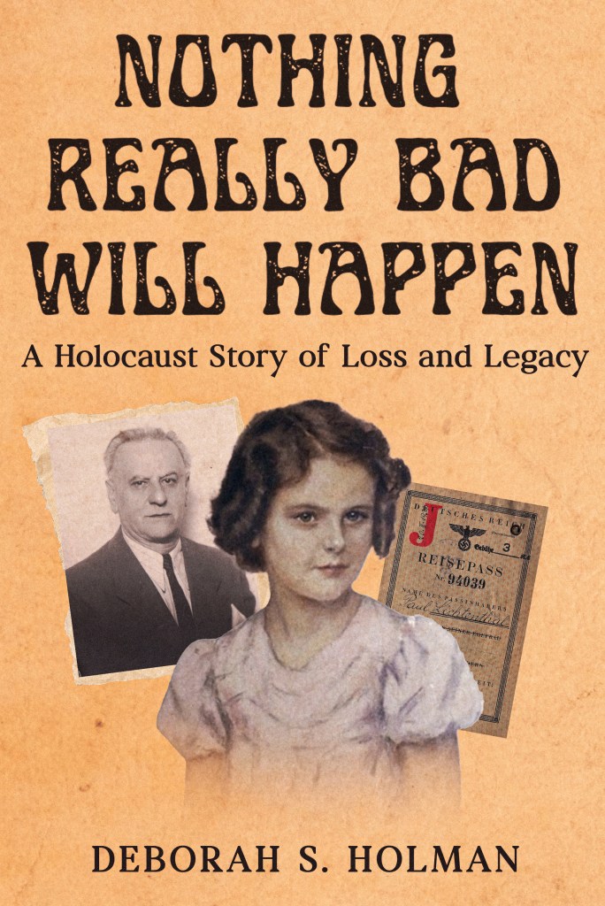
What I Changed: A Real Focal Point and Stronger First Impression
This new cover is still rooted in the same materials—family history, archival fragments, the past intruding into the present. But now it has something the earlier design lacked:
a center of gravity.
The title is larger and bolder, the subtitle is clear, and the imagery is anchored by faces and artifacts that immediately tell you what kind of story you’re about to enter: a child, a family, documents, and the visual texture of a life interrupted.
That matters—especially online.
Because whether we like it or not, readers make decisions fast. Your cover has about two seconds to say:
- This is a Holocaust story of loss and legacy.
- This is personal, researched, and real.
- This is a family story that carries weight.
And I wanted the cover to say it without whispering.
The Font Debacle (Yes, That Was a Thing)
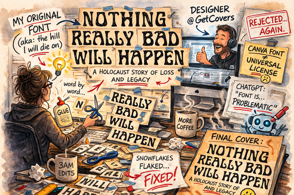
Then came what I can only call The Font Debacle.
I wanted to keep my original title font—the one I’d used from the beginning—because it felt like the book. Simple. Except GetCovers.com couldn’t use it. Even though it’s a Canva font, it turns out “available in Canva” does not mean “licensed for everyone everywhere.” The font is free on my account, but not something a designer can necessarily pull from their own library and use commercially.
So after a ridiculous amount of back-and-forth (and a small pile of rejected variations), I did the most reasonable thing a sane person would do: I rebuilt the title word by word as image files, so the designer could place and adjust them manually. That, somehow, is considered perfectly kosher.
During this saga, I was also ignoring various ChatGPT cover critiques that kept implying my font choice was a crime against design—one of them said the title and subtitle looked like “two different design philosophies shook hands and never spoke again,” which is rude but not entirely untrue. And just when I was ready to surrender and let the designer pick something new, a fresh version landed in my inbox… using my original font. I took it as a sign that my great-grandfather—or someone up there keeping tabs—approved my stubbornness.
Now we’ll see whether the algorithm agrees.
And While I Was In There…
And while I was in there? I fixed the 100+ little niggles that have been side-eyeing me for a couple years. You know—the kind of thing no reader notices, but the author wakes up at 3 a.m. thinking about. Goodbye to gems like “snowflakes flaked…” (I still can’t believe I let that live in public.)
Yes, I’m Also Wrestling the Amazon Algorithm (Aren’t We All)
Here’s the part where indie authors laugh politely and then go stare into the void.
Amazon is powerful. Amazon is useful. Amazon is… a mystery creature that changes moods without warning.
Some days it shows your book to the right readers. Some days it decides your book is best placed next to something completely unrelated and calls it “discovery.”
So yes: part of this redesign is about giving the book a fresh chance to be seen. A new cover can create a new visual hook. It can help a book look more professional in search results. It can help someone recognize it when they’ve seen it before.
Will it “solve” Amazon? No. Nothing solves Amazon. But I can at least show up with the strongest cover I can make, instead of hoping the algorithm develops a conscience.
The Other Big News: I’m Creating a Hardcover with a Dust Jacket
And this part matters to me just as much as the cover redesign.
I’m also producing Nothing Really Bad Will Happen in hardcover, with a dust jacket.
Why? Because this isn’t the kind of story that should feel temporary.
A paperback is practical. A paperback is affordable. A paperback is wonderful.
But a hardcover with a dust jacket is something else: it’s a legacy object. It’s the version you hand to a son or granddaughter. It’s the version that belongs on a shelf not as “a book I read once,” but as “a story we keep.”
I want a copy my family will be proud to own—one that:
- survives longer than a paperback
- holds up to being reread and shared
- looks and feels substantial
- gives the story the physical weight it deserves
Because the history inside it is not light. The lives inside it were not disposable. And I want the book’s format to reflect that reality.
As for the publication date for the hardcover with dust jacket: we’re close. I don’t have the exact “go live” day yet, because this edition is being produced through IngramSpark—which is even more finicky than Amazon, and that is saying something.
Also, when my latest Amazon proof arrived, the cover color was… peachy. No, I don’t mean “peachy” as in keen. I mean peachy as in the color. Peach. Not the vintage golden yellow I envisioned.
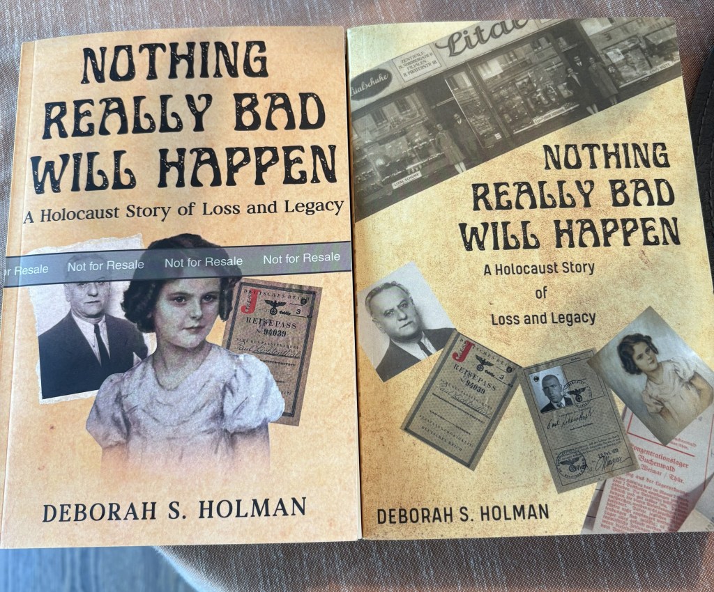
So there’s a small delay while the designer color-corrects, and then I’ll upload the updated files to IngramSpark and push everything through their approval process.
Stay tuned to this blog (yes, that means subscribe), or follow me on social media, and I’ll announce the moment the new editions are officially available.
Same Story. Better Doorway. Stronger Shelf Life.
So this is where things stand:
- A redesigned cover that’s clearer, stronger, and more compelling—especially online.
- A hardcover-with-dust-jacket edition that’s meant to last.
- The same story underneath it all: a family split by war, a child carried across an ocean, and the long, complicated inheritance of silence.
If you’ve read Nothing Really Bad Will Happen, thank you. Truly.
And if you haven’t—maybe this new cover (and this new format) will do what I needed the book to do all along:
Make you stop. Look closer. And understand that this is more than a book you scroll past.
It’s a story we keep.
You may be wondering, “But about Catherine, the Countess of Cons? Don’t worry. She’s moving right along. But that’s a story for another day!

Leave a reply to Tara Rothman Cancel reply